Factfulness in Business
- nickplaters
- Feb 23, 2022
- 8 min read
Is your data telling you something different?
One of the best-selling books of the last few years is called Factfulness by the late Hans Rosling. Rosling and his colleagues spent much of the last twenty years asking leaders of all types how well they understand the world and the trends in it. They even test them using a simple multiple-choice quiz. The book shows that most of us have misunderstood important global trends such as levels of poverty and world health. Rosling and his team attribute this partly to the way the media place greater emphasis on negative news and crisis and rarely tell us about gradual improvements. His team also found that people either misunderstood data or were using inaccurate information and analysis techniques to interpret the important trends in the world.
The book resonated with us as we see many parallels in the business world. We have heard from several board members and senior executives who have recognised that the “data” and so called “facts” they are presented with are either misrepresented or not telling the real story. As the amount of available data in business increases, we need even better techniques to make sense of it and draw the right conclusions. Some board members and senior executives already “sense check” the information they receive and make sure they understand the source. Some go even further and use direct observation of customer facing areas e.g., branches and contact centres, to make sure they have first-hand insights on how things work in practice.

Many businesses now have huge pools of available data (data lakes), so it is getting more complex to apply the right analysis technique to draw the right conclusions and make appropriate decisions. Perhaps one reason consultants are perceived as arrogant is that they so often question the data their clients have and look to interpret it in new ways. As we perform our diagnostic reviews, we find it essential to understand what information management have at their fingertips and how they are using this data. In this paper we share seven useful techniques that we have named:
The need to normalize
Unpicking averages and aggregates
The power of trends
Understand “the source” and measurement approach
Understand how the analytics work
Measure what matters (outcomes)
Information for observation and root causes.
Let's look at each in turn.
1. The need to normalize

Normalization is really the process of putting data in context. For example, the major banks in Australia often report their revenue growth relative to “system growth”. A bank saying that mortgage revenue is up 5% sounds positive but if the market or system is up 8% then the bank has grown “slower than system”. In that case the data can be “normalized” against the system and reported as 5% growth but 3% below system growth. That puts the single number into far better context. Percentages, rather than absolute numbers, provide a little bit of context because a $10m increase in revenue could be a fraction of a percentage for BHP but dramatic growth for a start-up.
We wrote a paper called “The Easiest Ease of Doing Business Score” which is based on the idea of “normalising” total contacts against a relevant figure of business growth. This puts it into context to create a unit of measure we call CPX, or contacts/X. Examples include contacts per thousand orders or contacts per hundred flights. These are great examples of adding greater insight by placing data in context.
2. Unpacking averages and aggregates
We’re amazed by how much management information is based in averages and how often

organizations have learnt to manipulate averages at the cost of other impacts. Averages are used everywhere from measuring individuals to revenue in a whole business. Averages are such “blunt” instruments that they can hide many other issues. For example, to hit a “service level” average target, many operations “over-staff” in quiet periods to lift the average. This means staff are not well utilised in these quiet periods which is very inefficient, but it is a way to lift the average.

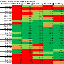
Front line staff manipulate averages by doing things like transferring work they could keep, hanging up on customers or rejecting items they could complete. We find it useful to unpack averages by doing things like showing service levels in contact centres in 15-minute intervals over a whole week to create a “heat map” of service in every period (see example left) rather than an average in all periods. Another option is to break work down into time bands (see example right). The opportunities look very different when you unpack an average this way.
3. The power of trends

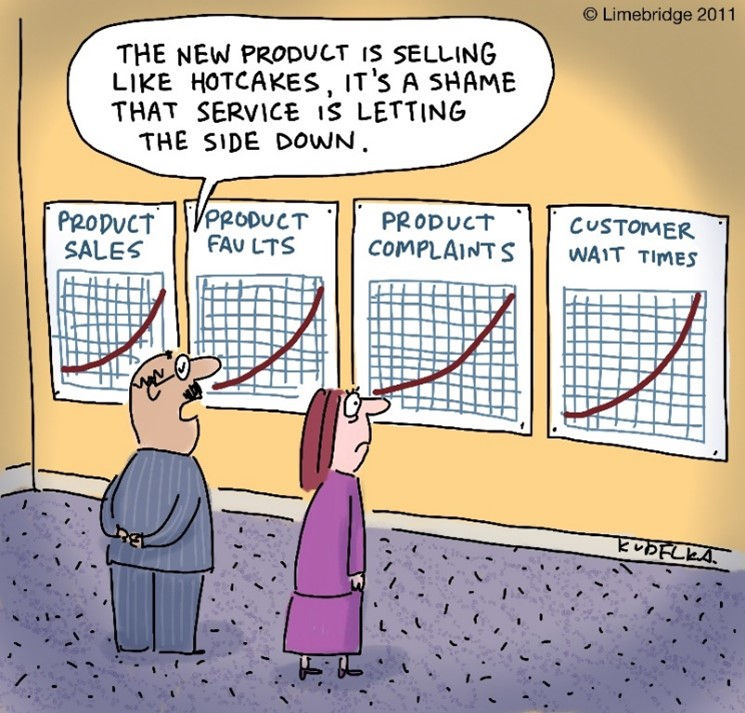
Normalization starts to put data in context, but trend analysis is a second key technique that shows context over time. Many management reports just provide point-in-time data snapshots that rely on the reader to understand whether a one-off data point represented a positive or negative change. Often companies use colours or up and down arrows to provide a limited trend. Showing a true trend over days, weeks or months provides far greater context that can inform decision making about whether this month's performance is something to worry about or not (see example).
4. Understand the source and measurement approach

Unfortunately, data can be manipulted and it's a natural tendency to try and make things look positive where reputations or even bonuses are at stake. We can understand why experienced board members make sure they understand where data comes from and its reliability. Here are five examples that we’ve seen that produce results that are less impressive once the mechanisms are understood:
Data from customer surveys that is impacted by how the survey is made available to customers. In many instances staff have to “invite” customers to participate and this produces a natural sample bias towards positive outcomes
The airline that never invites feedback on delayed flights to make the results more positive
The telco that found out they could move NPS by ringing the customer with a simple offer to update their details and gave them a survey straight afterwards
The insurance business that measured resolution by having staff tick a box to say if a call was resolved and of course they ticked it nearly all the time
The operation where staff got more productivity credits if they rejected an application than if they found a way to complete it. The whole team looked productive but at a great cost to the customer and business as they found any and every reason to reject the work.
One board member we know, was aware that there were limitations to the data she was receiving on complaints and issues. Her answer was to use direct “observation” of the Complaints team so she could hear from customers and spend time with the complaint handlers to ask them about common problems and causes. Another CEO we know did “unannounced” visits to the branch network so she could see the day-to-day reality for staff without window dressing by the management team (see also Information for observation below).
5. Understand how the analytics work
Analytics software is being used increasingly to interpret data and produce insights. Used well, these amazing tools can provide great insights by analysing speech or text data to explain things like contact reasons, repeat contacts or sources of complaints. However, in our experience the tools need to be shown what to look for and how. At one company the analytics team did a first pass through two

months contacts and said there were over 3,000 different reasons that customer called. In that case the analytics hadn’t been trained sufficiently to recognise where subtle language differences represented the same reason. For example, “did you get my payment?” and “where’s my payment?” were seen as distinct reasons when really, they were the same. At the other end of the spectrum, an analytics report in another business showed the monthly work drivers but did it at such a high level that the issues and problems were not clear. It merely reported that 10% of the contacts were Payments. This was too simplistic because some of those payment calls were caused by avoidable confusion around when payments were received and how and when they appeared on statements. Other payment calls were where customers were making a payment and needed a self-service solution. The analytics had not been shown how to make these important distinctions.
6. Understand and measure what matters
There is often a surprising disconnect between what matters to the company and customer and what gets measured. For example, we’ve seen major outsource contracts where the outsource provider wasn’t being measured on the outcomes that the organisation wanted. The reporting was focused on speed of response when the client was far more interested in the outcomes of the work performed. We’ve written separate papers on the importance of resolution to customers who make contact, and yet it remains unmeasured in many companies and guesstimated in others. We’ve seen many a “retention team” measured on immediate retention post contact but not on whether the customer was still there a few months later. In another client, the outsourcer was measured and provided regular data on internal transfers being below 2%. A 1-day observation in the teams showed that up to 40% of calls were being transferred though a consult type call procedure so were not caught by that measure, which allowed the outsourcer to avoid the target. These are just a few examples of measures and data disconnected from what matters.
7. Information for observation (and root cause analysis)

It's very hard to know what to fix or what to change using most data reports alone. If reports to the board show revenue falling then the first question asked will be why or was that expected? Similarly, if a team member is producing declining performance then an effective team leader will look to understand the issue. We call that “information for observation”. The data and reports are great for flagging issues and opportunities, but deeper analysis is needed to understand the causes and solutions. So, an effective leader or manager will have to observe the team members in action and meet with them to understand whether the problem is one of capability or motivation or both.
Nearly all kinds of data and reporting need a “deeper dive” of some sort like this because there can be so many variables. So, there is a distinction between the guidance provided by data and reporting, and the more complex analysis needed to change the outcomes being reported. Trying to put too much analysis into reporting can make it too confusing or lose sight of the big picture. But equally trying to take all decisions from reports may pull the wrong lever and fail to change the outcome. In our work we insist on performing direct observations of the work being performed (like the CEO and board member we described above) because you learn so much from doing that. You get to hear and see things like how customers explain their problems, how they react to front line staff, the obstacles that staff have to deal with and how systems and processes really work. In our experience, nothing beats observation if you want to make sense of or act on information.
Want to know more on these ideas?
We hope these ideas are of interest. How organizations report and use data is a constant fascination to us. It’s a theme we are always happy to discuss and will return to in articles later this year. Please feel free to contact us on the options below if you want to discuss the facts in your organization or have data holes and problems that you would like to address. If the issues we describe sound familiar, then we’d be interested to talk them through.
For more information email us at info@limebridge.com.au or call 03 9499 3550 or 0438652396. Factfulness, by Hans Rosling is poublished by Sceptre books.


Comments